Next.js 블로그 개발기
설 연휴간 무언가 하면서 보내고 싶었는데 과연 무엇을 하면 좋을까?
고민하다 생각한게 블로그를 만들어보자! 였다.
이유는 크게 2가지였는데 별거 없다...
- 다들 개발자 블로그 하나씩 만들어보시던데?
- Next.js 입문을 이걸로 하면 어떨까?
이렇게 두 가지 이유로 시작했다.
Next.js를 아무 것도 모르는 상태로 시작을 했고 TypeScript와 tailwindcss도 처음이라 설 연휴간 🐶고생을 하면서 만들었다.
이 과정에서 큰 도움을 준 레퍼런스를 먼저 말씀드리자면
-
https://miryang.dev/blog/build-blog-with-nextjs (강추)
기본적인 블로그 틀을 만드는데 가장 도움을 준 글로 Next.js의 세세한 내부 내용을 알려주시는 것은 아니지만 왜 이렇게 하셨는지, 어떤 라이브러리를 사용해야 하는지 등을 순서대로 잘 적어두셨다. 다시 한번 감사드린다. 🙇🏻♂️ -
https://tailwindcss.com/docs/installation
tailwindcss 공식 문서이다. 평소 사용하던 css관련 키워드를 검색하면 잘 알려준다. -
https://nextjs.org/docs/getting-started
Next.js 공식 문서이다. 궁금한 세부 사항이 있을 때 참고했다.
🥳 결과물
배포한 사이트는 다음과 같다.
바로가기
깃허브는 코드는 다음과 같다.
바로가기
miryang 님의 글에서 만드는 블로그 탬플릿을 많이 이용했다.
해당 탬플릿에서 개인적으로 추가하고 싶은 것들이 있었는데
다크모드(성공), 카테고리(해야함), 댓글(성공), Blog Post UI를 노션과 유사하게 만들기(해야함)
결과는 이렇게 되었다 하하.. 그러나 이 블로그 이제 태어났고 아직 발전할 것이기에 저 해야하는 친구들을 시간 날 때 처리할 예정이다.
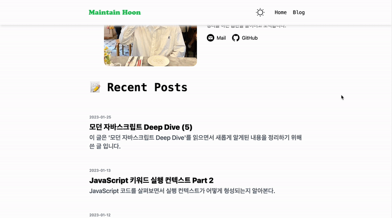
🖥 웹에서 보는 화면
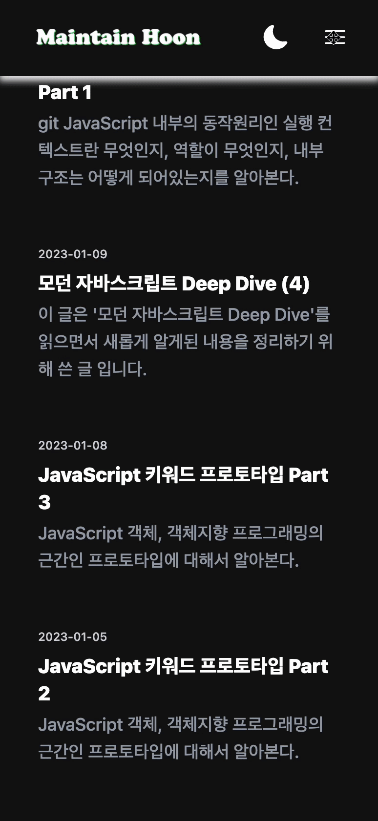
📱 모바일에서 보는 화면
⚙️ 과정
과정 설명에 앞서서 초기 내용들은 miryang 님 글을 많이 참고했으며 해당 부분은 miryang 님 게시글을 참고하는 것도 좋다.
1. 초기 설정
보일러플레이트 설치
yarn create next-app [원하는 폴더명 혹은 현위치면 .] --typescript
React를 이용한 개발을 하셨다면 익숙한 CRA 같은 느낌이다.
설치를 진행하면서 이것 저것을 물어볼건데 본인은 아래와 같이 했다.
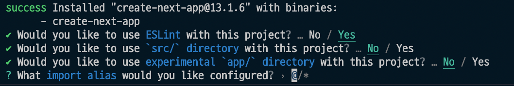
이후
- pages/api
- pages/index.tsx
- styles/Home.module.css
를 삭제해준다.
tailwindcss 설정
1. 설치한다.
yarn add -D tailwindcss postcss autoprefixer

2. config 파일 생성을 위한 코드 입력
npx tailwindcss init -p
이후 공식 문서의 Next.js 기반 이용 방법의 config를 참고해 설정해준다. 다만 우리는 13버전의 app과 src를 사용할거는 아니기 때문에 해당 라인만 제거하고 사용한다.
// ./tailwind.config.js 파일
/** @type {import('tailwindcss').Config} */
module.exports = {
  content: ['./pages/**/*.{js,ts,jsx,tsx}', './components/**/*.{js,ts,jsx,tsx}'],
  theme: {
    extend: {},
  },
  plugins: [],
};
이후 globals.css를 공식문서와 동일하게 설정해준다.
/* ./styles/globals.css 파일 */
@tailwind base;
@tailwind components;
@tailwind utilities;
권장하는 vscode 확장 프로그램
- ESLint: 자바스크립트 코드의 문법을 검사해준다.
- Tailwind CSS IntelliSense: tailwind 문법을 자동완성 혹은 힌트를 준다.
- prettier: 코드 정렬을 본인 입맛에 맞게 해준다.
추가 라이브러리들
ESlint 관련 설정을 하는데 본인은 다른 프로젝트에서 쓰던 내용이 있었어서 해당 내용을 가져오고 관련 내용들을 넣었다.
yarn add -D @typescript-eslint/eslint-plugin eslint-config-prettier eslint-plugin-prettier
// .eslintrc.json -> .eslintrc.js
module.exports = {
  env: {
    // 전역 변수 사용을 정의합니다. 추가하지 않으면 ESLint 규칙에 걸리게 됩니다.
    browser: true,
    es6: true,
    node: true,
  },
  extends: [
    'eslint:recommended',
    'plugin:react/recommended',
    'plugin:@typescript-eslint/recommended', // 해당 플러그인의 권장 규칙을 사용합니다.
    'plugin:prettier/recommended',
    'next',
  ],
  parser: '@typescript-eslint/parser', // ESLint 파서를 지정합니다.
  parserOptions: {
    ecmaFeatures: {
      jsx: true, // JSX를 파싱할 수 있습니다.
    },
    ecmaVersion: 12, // Modern ECMAScript를 파싱할 수 있습니다.
    sourceType: 'module', // import, export를 사용할 수 있습니다.
  },
  plugins: ['react', '@typescript-eslint'],
  rules: {
    // ESLint 규칙을 지정합니다. extends에서 지정된 규칙을 덮어 쓸수도 있습니다.
    'react/react-in-jsx-scope': 'off',
    'react/prop-types': 'off',
  },
  settings: {
    react: {
      version: 'detect', // 현재 사용하고 있는 react 버전을 eslint-plugin-react가 자동으로 감지합니다.
    },
  },
};
Prettier 설정은 다음과 같이 해줬다.
yarn add -D prettier
// .prettierrc.js 생성
module.exports = {
  singleQuote: true,
  trailingComma: 'all',
  printWidth: 100,
  semi: true,
  tabWidth: 2,
};
이렇게 설정하고 한번 테스트 서버를 실행해본다.
yarn dev
2. 라우팅
간단하게 이야기하면 Next.js 에서는 pages 폴더 내부에 파일을 정의하면 해당 경로 라우팅이 자동으로 적용된다. 몇 가지 다른 경우들도 있는데 이는 Next.js 공식문서를 참고하면 좋다.
크게 '/' 페이지와 '/blog' 페이지를 만들 예정이므로 해당 페이지들을 먼저 만들어준다.
// pages/index.tsx
export default function Home() {
  return <div className="text-lg">Home<div>
}
// pages/blog/index.tsx
export default function Blog() {
return <div className="text-lg">Blog<div>
}3. GNB & Header 만들기
공통으로 사용할 네비게이션 바를 만들어야 한다.
차후 링크들을 관리할 수 있도록 우선 링크들을 모아둔 데이터를 만든다.
// data/navlinks.ts
const navlinks: { title: string, link: string }[] = [
  { title: 'Home', link: '/' },
  { title: 'Blog', link: '/blog' },
];

export default navlinks;
해당 데이터를 사용하는 Nav 컴포넌트를 생성한다.
props에 type과 onClick 속성을 넣었는데 이는 창이 좁아지거나 모바일 화면에서 메뉴 버튼과 모달창을 이용하고 싶어서 적용하였다.
// components/Nav.tsx
import Link from 'next/link';
import { nav } from '@/data/nav';

interface NavProps {
  type: 'toggle' | 'normal';
  onClick?: () => void;
}

export default function Nav({ type, onClick }: NavProps) {
  const defaultStyleString =
    'dark:text-white dark:hover:text-green-500 text-center transition duration-250 hover:scale-125 hover:text-green-500';
  return (
    <>
      {nav.map((item) => {
        const { title, location } = item;
        return (
          <Link
            href={location}
            key={title}
            className={
              type === 'normal' ? defaultStyleString : defaultStyleString + ' text-lg py-4'
            }
            onClick={
              onClick
                ? onClick
                : () => {
                    return;
                  }
            }
          >
            {title}
          </Link>
        );
      })}
    </>
  );
}
위 Nav를 이용할 수 있는 Header컴포넌트를 만들어보자
준비물은 크게 2개로 다크모드에 사용할 이미지와 라이트모드에 사용할이미지를 준비하면 된다. free svg라고 검색하면 쉽게 구할 수 있다.
해당 파일들은 public의 images폴더를 만들어서 따로 관리한다.
본인은 로고도 버전에 따라서 2개를 준비했는데 따라해도 좋고 하나를 준비해서 바꿔줘도 된다.
😥주의 tailwindcss를 이번에 처음 사용하면서 뭔가 필요 없는 것을 넣었거나 이상할 수 있습니다.
// components/Header.tsx
import { useEffect, useRef, useState } from 'react';
import Nav from './Nav';
import Image from 'next/image';
import Head from 'next/head';
import Link from 'next/link';

type Theme = null | 'dark' | 'light';

export default function Header() {
  const headerRef = useRef<HTMLElement>(null);
  const toggleRef = useRef<HTMLDivElement>(null);
  const [onToggle, setOnToggle] = useState<boolean>(false);
  const [theme, setTheme] = useState<Theme>(null);

  // 테마를 전환하기 위해 사용했다.
  const handleTheme = () => {
    const newTheme = theme === 'dark' ? 'light' : 'dark';
    setTheme(newTheme);
    // 사용자 로컬 스토리지에 저장하고 태마 변경시마다 body의 class를 바꿔준다.
    window.localStorage.setItem('theme', newTheme);
    document.body.className = newTheme;
  };

  // 스크롤이 내려가면 헤더 하단에 그림자 속성을 주기 위해서 사용했다.
  const handleScroll = () => {
    if (window.scrollY > 0) {
      headerRef.current?.classList.add('shadow-[0_5px_7px_0px_#ececec]');
      return;
    }
    headerRef.current?.classList.remove('shadow-[0_5px_7px_0px_#ececec]');
  };

  // 모달을 켜고 끄기 위해서 사용했다.
  const handleToggle = () => {
    if (onToggle) toggleRef.current?.classList.add('hidden');
    else toggleRef.current?.classList.remove('hidden');
    setOnToggle((prev) => !prev);
  };

  // 스크롤 이벤트와 테마를 적용하는 코드를 넣어준다.
  useEffect(() => {
    window.addEventListener('scroll', handleScroll);
    setTheme(document.body.className as Theme);
    return () => {
      window.removeEventListener('scroll', handleScroll);
    };
  }, []);

  // 스타일은 자유 변경이 가능하다.
  return (
    <>
      <Head>
        <title>본인 블로그의 타이틀</title>
      </Head>
      <header
        ref={headerRef}
        className="sticky top-0 left-0 w-full z-10 h-20 font-mono transition duration-500 bg-white dark:bg-[#111111]"
      >
        <div className="text-black max-w-screen-md h-20 flex flex-nowrap items-center justify-between m-auto px-8">
          <Link href="/">
            {theme === 'dark' ? (
              <Image src="/images/logoDarkMode.png" alt="profile" width={180} height={30} />
            ) : (
              <Image src="/images/logoLightMode.png" alt="profile" width={180} height={30} />
            )}
          </Link>
          <div className="flex flex-nowrap gap-8 items-center">
            <button type="button" className="m-0 p-0" onClick={handleTheme}>
              {theme === 'dark' ? (
                <Image src="/images/moon.svg" alt="dark mode" width={30} height={30} />
              ) : (
                <Image src="/images/sun.svg" alt="light mode" width={30} height={30} />
              )}
            </button>
            <button type="button" className="m-0 p-0 sm:hidden" onClick={handleToggle}>
              <svg
                xmlns="http://www.w3.org/2000/svg"
                viewBox="0 0 24 24"
                strokeWidth={1.5}
                stroke="currentColor"
                className="w-7 h-7 transition duration-500 stroke-black dark:stroke-white"
              >
                <path
                  strokeLinecap="round"
                  strokeLinejoin="round"
                  d="M3.75 6.75h16.5M3.75 12h16.5m-16.5 5.25h16.5"
                />
              </svg>
            </button>
            <div className="flex-nowrap items-center justify-center gap-5 text-center hidden sm:flex">
              <Nav type="normal" />
            </div>
          </div>
        </div>
        <div
          ref={toggleRef}
          className="w-full h-screen absolute top-20 left-0 bg-white flex-col flex-nowrap p-5 flex hidden dark:bg-[#111111]"
        >
          <Nav type="toggle" onClick={handleToggle} />
        </div>
      </header>
    </>
  );
}
4. Layout 만들기
페이지 공통으로 적용할 레이아웃을 만들어보자.
크게 다른거를 만들 것은 아니고 헤더, 푸터를 담을 그릇을 만들고, 해당 컴포넌트를 적용해줄 것이다.
먼저 간단하게 Footer를 만들어보자
// components/Footer.tsx
export default function Footer() {
  return (
    <footer className="w-full font-mono flex flex-col justify-center items-center pt-10 pb-6 transition duration-500 bg-white dark:bg-[#111111] dark:text-white text-black">
      <div className="flex justify-center gap-4 items-center pt-4 border-t-2 w-36">
        <a
          href="mailto:본인의 이메일 주소 기입"
          className="hover:scale-110 transition-transform duration-500 hover:text-green-500 hover:fill-green-500 dark:fill-white dark:hover:fill-green-500"
        >
          <svg xmlns="http://www.w3.org/2000/svg" width="24" height="24" viewBox="0 0 24 24">
            <path d="M12 .02c-6.627 0-12 5.373-12 12s5.373 12 12 12 12-5.373 12-12-5.373-12-12-12zm6.99 6.98l-6.99 5.666-6.991-5.666h13.981zm.01 10h-14v-8.505l7 5.673 7-5.672v8.504z" />
          </svg>
        </a>
        <a
          href="본인의 github 주소 기입"
          className="hover:scale-110 transition-transform duration-500 hover:text-green-500 hover:fill-green-500 dark:fill-white dark:hover:fill-green-500"
        >
          <svg xmlns="http://www.w3.org/2000/svg" width="24" height="24" viewBox="0 0 24 24">
            <path d="M12 0c-6.626 0-12 5.373-12 12 0 5.302 3.438 9.8 8.207 11.387.599.111.793-.261.793-.577v-2.234c-3.338.726-4.033-1.416-4.033-1.416-.546-1.387-1.333-1.756-1.333-1.756-1.089-.745.083-.729.083-.729 1.205.084 1.839 1.237 1.839 1.237 1.07 1.834 2.807 1.304 3.492.997.107-.775.418-1.305.762-1.604-2.665-.305-5.467-1.334-5.467-5.931 0-1.311.469-2.381 1.236-3.221-.124-.303-.535-1.524.117-3.176 0 0 1.008-.322 3.301 1.23.957-.266 1.983-.399 3.003-.404 1.02.005 2.047.138 3.006.404 2.291-1.552 3.297-1.23 3.297-1.23.653 1.653.242 2.874.118 3.176.77.84 1.235 1.911 1.235 3.221 0 4.609-2.807 5.624-5.479 5.921.43.372.823 1.102.823 2.222v3.293c0 .319.192.694.801.576 4.765-1.589 8.199-6.086 8.199-11.386 0-6.627-5.373-12-12-12z" />
          </svg>
        </a>
      </div>
      <div className="text-sm mt-2">Copyright © 2023 JiHoon Yoo</div>
      <div className="text-xs mt-2">maintain.dev</div>
    </footer>
  );
}
이후 위 푸터와 이전에 만들어둔 헤더를 이용한 Layout 컴포넌트를 만든다.
// components/Layout.tsx
import { ReactNode } from 'react';
import Footer from './Footer';
import Header from './Header';

interface LayoutProps {
  children: ReactNode;
}

export default function Layout(props: LayoutProps) {
  return (
    <>
      <Header />
      <main className="transition duration-500 bg-white dark:bg-[#111111] text-black dark:text-white">
        <div className="max-w-screen-md flex flex-col px-10 m-auto">{props.children}</div>
      </main>
      <Footer />
    </>
  );
}
이제 위 Layout을 적용해보자 방법은 간단하다. _app.tsx에 Layout을 넣어주면 된다.
// pages/_app.tsx
import '@/styles/globals.css';
import type { AppProps } from 'next/app';
import Layout from '@/components/Layout';

export default function App({ Component, pageProps }: AppProps) {
  return (
    <Layout>
      <Component {...pageProps} />
    </Layout>
  );
}
5. 다크모드를 위한 추가
다크모드를 처음에 만들어볼 때 문제가 있었다.
바로 저장이 안된다는 것과 테마가 다른 경우 초기 로딩때 반짝! 하고 점멸을 한다는 것이다. 이를 해결하기 위해서 아래 코드를 추가해서 초기에 로딩 후 처리를 해주게 만들자
// pages/_document.tsx
import { Html, Head, Main, NextScript } from 'next/document';

// 초기 테마 모드 설정
function setInitialColorMode() {
  // 내부에 저장되어 있는 값 혹은 mediaQuery의 값을 찾아서 적용해준다.
  function getInitialColorMode() {
    const preference = window.localStorage.getItem('theme');
    const hasExplicitPreference = typeof preference === 'string';

    if (hasExplicitPreference) {
      return preference;
    }

    const mediaQuery = '(prefers-color-scheme: dark)';
    const mql = window.matchMedia(mediaQuery);
    const hasImplicitPreference = typeof mql.matches === 'boolean';
    if (hasImplicitPreference) {
      return mql.matches ? 'dark' : 'light';
    }

    return 'dark';
  }
  const colorMode = getInitialColorMode();
  document.body.className = colorMode;
}

const blockingSetInitialColorMode = `(function() {
    ${setInitialColorMode.toString()}
    setInitialColorMode();
})()
`;

export default function Document() {
  return (
    <Html lang="ko">
      <Head></Head>
      <body>
        <script
          dangerouslySetInnerHTML={{
            __html: blockingSetInitialColorMode,
          }}
        ></script>

        <Main />
        <NextScript />
      </body>
    </Html>
  );
}
6. contentlayer
contentlayer는 mdx 파일을 읽어서 HTML구조로 만들어주는 라이브러리로 miryang님의 블로그에 소개가 되어있다.
본인 또한 해당 contentlayer 라이브러리를 사용해서 적용했고 코드 블록 부분만 조금 다르게 했다.
1. 기본적인 contentlayer 라이브러리를 설치한다.
yarn add contentlayer next-contentlayer
2. 코드블록을 위한 라이브러리를 설치한다.
yarn add rehype-pretty-code shiki
설치를 완료했으면 설정 파일을 생성해준다.
// contentlayer.config.ts
import { defineDocumentType, makeSource } from 'contentlayer/source-files';
import rehypePrettyCode from 'rehype-pretty-code';

// 원하는 코드 블록 테마가 있다면 찾아서 적용하면 된다.
const options = {
  theme: 'github-dark',
};

export const Post = defineDocumentType(() => ({
  name: 'Post',
  contentType: 'mdx',
  filePathPattern: `**/*.mdx`,
  fields: {
    title: { type: 'string', required: true },
    date: { type: 'string', required: true },
    description: { type: 'string', required: true },
  },
}));

export default makeSource({
  contentDirPath: 'posts',
  documentTypes: [Post],
  mdx: {
    rehypePlugins: [[rehypePrettyCode, options]],
  },
});
이후에는 Next.js 플러그인으로 설정해준다.
// next.config.js
/** @type {import('next').NextConfig} */

// eslint-disable-next-line @typescript-eslint/no-var-requires
const { withContentlayer } = require('next-contentlayer');

module.exports = withContentlayer({
  reactStrictMode: true,
});
이러면 설정은 완료되었다. 본인이 작성한 블로그 글이나 다른 글들을 posts 라는 폴더를 생성해서 적어주면 된다.
하나의 예시를 들어주면 다음과 같다.
## // posts/test.mdx

title: 제목
date: 2023-01-29
description: 설명

---

## 제목

- 내용 1
- 내용 2
7. 블로그 글 페이지 생성
Next.js 는 정적으로 페이지를 생성하는 기능을 제공한다. 빌드 타임시 미리 페이지를 생성해두고 해당 페이지 정보를 주는 것이다.
우리가 만드는 블로그라는 것은 한번 작성하거나 하면 크게 변화가 생기지도 않고 실시간으로 보여줘야하는 내용이 없기 때문에 정적으로 생성하는 방식을 사용할 것이다.
이때 사용하는 것이 getStaticProps와 getStaticPaths 라는 함수이다. 이를 이용해서 블로그 글 페이지를 만들어보자
여기서 Utterances를 적용해서 본인은 댓글을 추가했다.
먼저 Utterances를 보면 아래와 같다.
// components/Utterances.tsx
import { memo } from 'react';

function Utterances() {
  return (
    <section
      ref={(elem) => {
        if (!elem) return;
        const scriptElement = document.createElement('script');
        scriptElement.src = 'https://utteranc.es/client.js';
        scriptElement.async = true;
        scriptElement.setAttribute('repo', '본인의 utterances 레포지토리');
        scriptElement.setAttribute('issue-term', '댓글을 어떻게 관리할 것인지');
        scriptElement.setAttribute('theme', '원하는 테마');
        scriptElement.setAttribute('crossorigin', 'anonymous');
        elem.appendChild(scriptElement);
      }}
    />
  );
}

export default memo(Utterances);
이제 블로그 페이지를 만들어본다.
// pages/blog/[slug].tsx
import { allPosts } from '@/.contentlayer/generated';
import {
  GetStaticPaths,
  GetStaticProps,
  GetStaticPropsContext,
  InferGetStaticPropsType,
} from 'next';
import { useMDXComponent } from 'next-contentlayer/hooks';
import Utterances from '@/components/Utterances';

const Post = ({ post }: InferGetStaticPropsType<typeof getStaticProps>) => {
  const MDXComponent = useMDXComponent(post.body.code);
  return (
    <>
      <div className="mt-10 pb-10 border-b-2 mb-10 prose dark:prose-invert">
        <h1 className="mb-16">{post.title}</h1>
        <MDXComponent />
      </div>
      <Utterances />
    </>
  );
};

export const getStaticPaths: GetStaticPaths = async () => {
  return {
    paths: allPosts.map((p) => ({ params: { slug: p._raw.flattenedPath } })),
    fallback: false,
  };
};

export const getStaticProps: GetStaticProps = async ({ params }: GetStaticPropsContext) => {
  const post = allPosts.find((p) => p._raw.flattenedPath === params?.slug);
  return {
    props: {
      post,
    },
  };
};

export default Post;
8. 인덱스 페이지 생성
이제 마지막이다. / 와 /blog 로 이동했을 경우 보여주는 페이지를 만들어보자
우선 두 페이지에서 블로그 글 리스트를 보여줘야 하므로 해당 부분을 담당하는 컴포넌트를 만든다.
크게 블로그 포스트로 이동하는 링크 컴포넌트와 해당 링크 포스트 리스트를 담당하는 컴포넌트 두개를 만든다.
// components/BlogPost.tsx
import Link from 'next/link';

interface BlogPostProps {
  date: string;
  title: string;
  des: string;
  slug: string;
}

const BlogPost = ({ date, title, des, slug }: BlogPostProps) => {
  return (
    <Link href={`/blog/${slug}`} passHref className="w-full my-7">
      <div className="font-medium text-xs transition text-gray-500 dark:text-gray-300">{date}</div>
      <div className="font-extrabold text-xl sm:text-2xl mt-2 transition hover:text-green-500">
        {title}
      </div>
      <div className="font-medium text-lg transition text-gray-600 dark:text-gray-400 sm:text-xl mt-1">
        {des}
      </div>
    </Link>
  );
};

export default BlogPost;
// components/PostList.tsx
import { Post } from 'contentlayer/generated';
import BlogPost from '@/components/BlogPost';
interface RecentPostsProps {
posts: Post[];
}
export default function PostList({ posts }: RecentPostsProps) {
return (
<div className="flex flex-col">
{posts.map((post: Post) => (
<BlogPost
date={post.date}
title={post.title}
des={post.description}
slug={post._raw.flattenedPath}
key={post._id}
/>
))}
</div>
);
}이제 사용할 컴포넌트를 만들었으므로 마지막 큰 뼈대를 만들어준다.
// pages/blog/index.tsx
import { allPosts } from 'contentlayer/generated';
import { GetStaticProps, InferGetStaticPropsType } from 'next';
import PostList from '@/components/PostList';

export const getStaticProps: GetStaticProps = async () => {
  const posts = allPosts.sort((a, b) => Number(new Date(b.date)) - Number(new Date(a.date)));

  return {
    props: {
      posts,
    },
  };
};

export default function Blog({ posts }: InferGetStaticPropsType<typeof getStaticProps>) {
  return (
    <>
      <section className="mt-12 mb-10">
        <h1 className="font-bold text-2xl sm:text-4xl font-mono">📝 Blog</h1>
      </section>
      <PostList posts={posts} />
    </>
  );
}
프로필 이미지를 하나 준비해서 본인의 프로필 이미지를 넣으면 된다.
// pages/index.tsx
import { allPosts } from 'contentlayer/generated';
import { GetStaticProps, InferGetStaticPropsType } from 'next';
import PostList from '@/components/PostList';
import Image from 'next/image';
export const getStaticProps: GetStaticProps = async () => {
const posts = allPosts.sort((a, b) => Number(new Date(b.date)) - Number(new Date(a.date)));
return {
props: {
posts: posts.slice(0, 5),
},
};
};
export default function Home({ posts }: InferGetStaticPropsType<typeof getStaticProps>) {
return (
<>
<section className="my-10">
<h1 className="font-bold text-2xl sm:text-4xl font-mono">🧑🏻💻 Maintain Hoon</h1>
</section>
<section className="flex justify-center gap-8 items-center flex-wrap">
<Image
src="/images/profile.jpeg"
alt="profile"
width={300}
height={300}
className="rounded-2xl"
/>
<div className="min-w-[250] max-w-[300px]">
<h2 className="font-bold text-xl">본인을 설명하는 가장 핵심 문구</h2>
<br />
<p>본인에 대한 설명</p>
<p>본인에 대한 설명</p>
<div className="flex gap-5 items-center mt-4">
<a
href="mailto:본인의 email 주소"
className="flex gap-2 items-center hover:scale-110 transition-transform duration-500 hover:text-green-500 hover:fill-green-500 dark:fill-white dark:hover:fill-green-500"
>
<svg xmlns="http://www.w3.org/2000/svg" width="24" height="24" viewBox="0 0 24 24">
<path d="M12 .02c-6.627 0-12 5.373-12 12s5.373 12 12 12 12-5.373 12-12-5.373-12-12-12zm6.99 6.98l-6.99 5.666-6.991-5.666h13.981zm.01 10h-14v-8.505l7 5.673 7-5.672v8.504z" />
</svg>
<p>Mail</p>
</a>
<a
href="본인의 github 주소"
className="flex gap-2 items-center transition-transform duration-500 hover:scale-110 hover:text-green-500 hover:fill-green-500 dark:fill-white dark:hover:fill-green-500"
>
<svg xmlns="http://www.w3.org/2000/svg" width="24" height="24" viewBox="0 0 24 24">
<path d="M12 0c-6.626 0-12 5.373-12 12 0 5.302 3.438 9.8 8.207 11.387.599.111.793-.261.793-.577v-2.234c-3.338.726-4.033-1.416-4.033-1.416-.546-1.387-1.333-1.756-1.333-1.756-1.089-.745.083-.729.083-.729 1.205.084 1.839 1.237 1.839 1.237 1.07 1.834 2.807 1.304 3.492.997.107-.775.418-1.305.762-1.604-2.665-.305-5.467-1.334-5.467-5.931 0-1.311.469-2.381 1.236-3.221-.124-.303-.535-1.524.117-3.176 0 0 1.008-.322 3.301 1.23.957-.266 1.983-.399 3.003-.404 1.02.005 2.047.138 3.006.404 2.291-1.552 3.297-1.23 3.297-1.23.653 1.653.242 2.874.118 3.176.77.84 1.235 1.911 1.235 3.221 0 4.609-2.807 5.624-5.479 5.921.43.372.823 1.102.823 2.222v3.293c0 .319.192.694.801.576 4.765-1.589 8.199-6.086 8.199-11.386 0-6.627-5.373-12-12-12z" />
</svg>
<p>GitHub</p>
</a>
</div>
</div>
</section>
<section className="mt-12 mb-10">
<h1 className="font-bold text-2xl sm:text-4xl font-mono">📝 Recent Posts</h1>
</section>
<PostList posts={posts} />
</>
);
}😃 후기
일단은 간단하게 블로그를 만들어보았다.
계획했던 추석 기간이 아니라 더 넘어서 걸리기는 했다...
그래서 개발에만 집중하다보니 개발기를 좀 너무 엉성하게 적은 것은 아닌가 싶기도 하다.
가장 걱정은 지금 올린 이 코드대로 따라하면 내 블로그가 똑같이 만들어지는 것인지, 내가 잘 설명을 한 것인지 걱정이다.
체크를 한번 해보고 글을 추가하도록 하겠다.
앞으로는 일단 블로그 포스트 컴포넌트를 조금 손보고 카테고리 기능을 추가하려고 한다. 해당 기능을 추가하고 글을 쓸만하면 적어볼 예정이다.